Visualizing our Deployment Pipeline
The Annotated Timeline
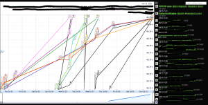
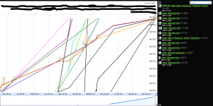
This graph may seem intimidating at first, so don’t be scared and let’s dive right into it… BTW, you may click on the image to enlarge it.
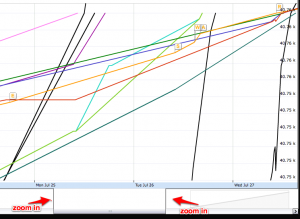
In this graph the x axis shows the time (date and time of day) and the y axis shows the svn revision number. Each colored line represents a single module (so we have one line for www and one line for the BehavioralEngine etc).
What you would usually see is for each line (representing a module) a monotonically increasing value over time, a line form the bottom left corner towards the top right corner, however, in relatively rare cases where a developer wants to deploy an older version of his module, then you clearly see it by the line suddenly dropping down a bit instead of climbing up; this is really nice, helps find unusual events.
The Histogram
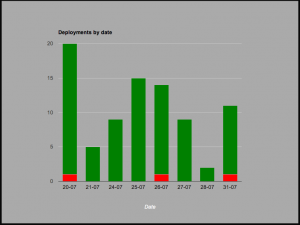
In the next graph you see an overview of deployments per day. (click to enlarge)
This is more of a holistic view of how things went the last couple of days, it just shows how many deployments took place each day (counts production clusters only) and colors the successful ones in green and the failed ones in red.
This graph is like an executive summary that can tell the story of – in case there are too many reds (or there are reds at all), then someone needs to take that seriously and figure out what needs to be fixed (usually that someone is me…) – or in case the bars aren’t high enough, then someone needs to kick developer’s buts and get them deployin somethin already…
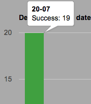
Like many other graphs from google’s library (this one’s a Stacked Column Chart, BTW), it shows nice tooltips when hovering over any of the columns with their x values (the date) and their y value (number of successful/failed deployments)
Versions DNA Mapping
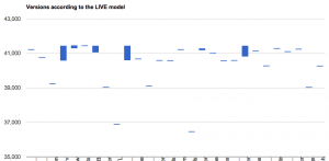
The following graph shows the current variety of versions that we have in our production systems for each and every module. It was attributed as a DNA mapping by one of our developers b/c of the similarity in how they look but that’s how far this similarity goes…
The x axis lists the different modules that we have (names were intentionally left out, but you can imaging having www and other folks there). The y axis shows the svn versions of them in production. It uses glu’s live model as reported by glu’s agents to zookeeper.
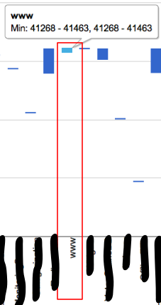
Let’s zoom in a bit:
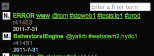
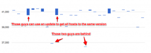
What this diagram tells us is that the module www has versions starting from 41268 up to 41463 in production. This is normal as we don’t necessarily deploy everything to all servers at once, but this graph helps us easily find hosts that are left behind for too long, so for example if one of the modules had not been deployed in a while then you’d see it falling behind low on the graph. Similarly, if a module has a large variability in versions in production, chances are that you want to close that gap pretty soon. The following graph illustrates both cases:
To implement this graph I used a crippled version of the Candle Stick Chart, which is normally used for showing stock values; it’s not ideal for this use case but it’s the closest I could find.
That’s all, three charts is enough for now and there are other news regarding our evolving deployment system, but they are not as visual; if you have any questions or suggestions for other types of graphs that could be useful don’t be shy to comment or tweet.
1 Trackback(s)
Sorry, comments for this entry are closed at this time.